Evaluating Turo’s rebuilt search experience
A usability study of the flow where Turo’s revenue starts: search to booking. Most of what it found was usability cleanup. The biggest finding changed how the company thought about delivery on both sides of its marketplace.
via UserZoom Go
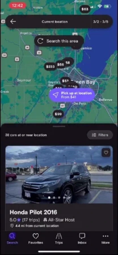
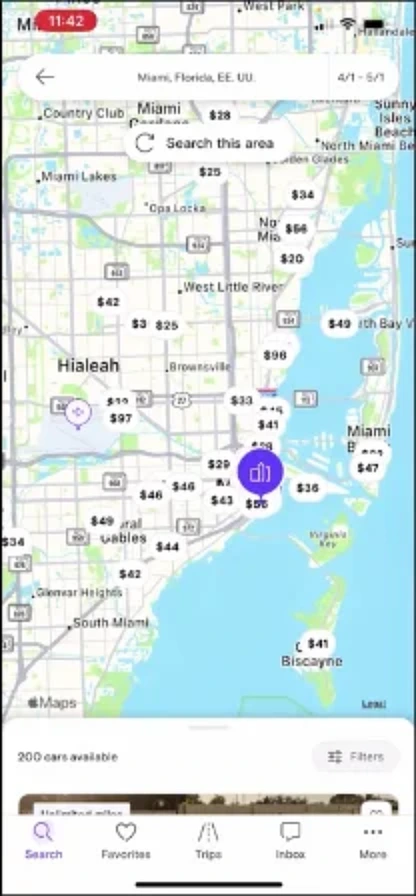
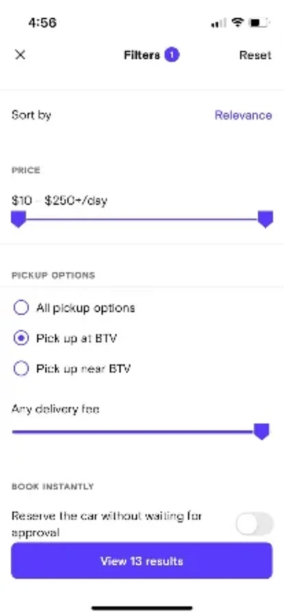
Background
Search sits at the top of Turo’s funnel. A guest who can’t find the right car, or doesn’t understand what they’re looking at, doesn’t book, so the flow has about as direct a line to revenue as anything in the product.
Turo had just rebuilt it from the ground up, a wholesale replacement that years of accumulated technical debt had made more practical than incremental change. The new experience was live for half of users when I ran this study. My job was to understand how people moved through it and where it broke down.
Research design
I ran the study across three scenarios: a local rental near home, an airport pickup, and a non-airport destination (a car for a weekend staying at a hotel). Running them together was the point: a problem that shows up in one scenario is a usability issue you file, while a problem that shows up in all three is a product problem you escalate.
I recruited 18 first-time users through UserZoom Go, all US-based, on iOS, who had rented a vehicle in the past year but never used Turo. First-timers mattered because prior rental car experience shapes expectations, and longtime Turo guests have already adapted to the product’s quirks. New users can still see the friction that regulars have learned to ignore.
The 50% rollout added a wrinkle: nothing guaranteed a panelist would land on the new experience, so I recruited about twice as many sessions as I needed and threw out the ones on the old version. Unmoderated sessions are cheap, and a few seconds of video told me which version someone was on. There was no account or device to pre-assign to the rollout for people who had never installed the app, so oversampling and filtering was the practical way through.
What I found
Three insights ran through the study, and the first explains the other two. Guests arrived carrying a rental car company mental model and never put it down.
Guests expected cars at the airport, even when the airport wasn’t their search
Half of all participants assumed their results were at the airport for no reason other than that they’d typed the airport into search. Some assumed it when the airport had never been their query at all. One person searched “Four Seasons Hotel Miami,” then said their car was at the airport. At a rental company, cars live at the airport, so that’s where guests expected Turo’s to be too.
“I’m still in the mode of automatically getting things at the airport because it’s a rental.”— Participant, after a city search returned cars not at the airport
Airport delivery, and the fee for it, came as a surprise
Delivery itself was unfamiliar across the board. The idea that a car could be brought to a place the guest chose was foreign to people whose only reference was a rental counter, and most had never knowingly had a car delivered. Even at a destination as deliberate as a hotel, guests didn’t expect it.
“It didn’t instantly occur to me that Turo cars would be available at the Four Seasons.”— Participant, in the hotel scenario
The surprise bit hardest at the airport. There, guests least expected to pay anything extra, because the airport is the one place a rental always just waits for you. When a fee surfaced, it read as a penalty for something they assumed was free everywhere else, and they went looking for a way around it.
“$35 to get it at the airport? That sucks!”— Participant, discovering the pickup fee
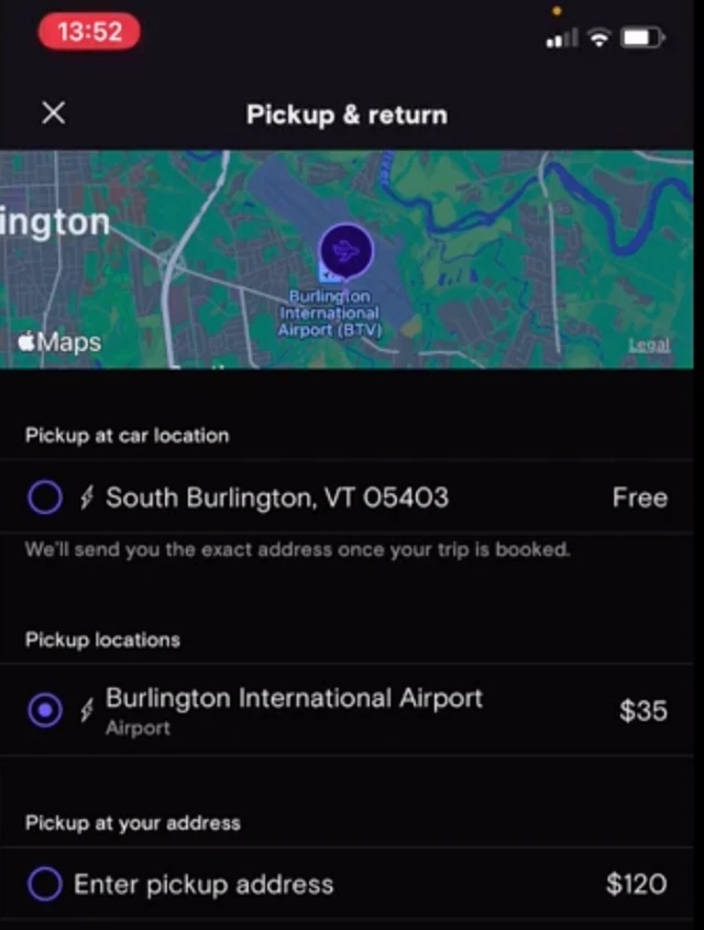
The new map failed at the airport, the exact place it was meant to help
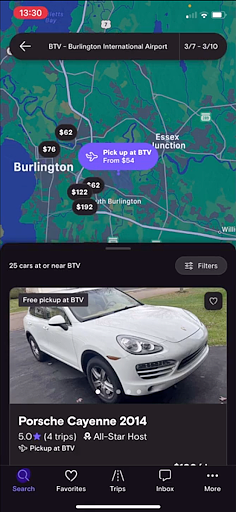
The team had built genuinely new map functionality, hoping it would help a guest who searched the airport see that cars were available elsewhere too. But most people skipped the map for the familiar list. Price pins were understood; the point-of-interest pins meant to signal other pickup spots were not. And for someone who searched the airport, the map mostly showed cars that weren’t there. Rental car sites often collapse or drop the map for airport queries entirely, an established pattern Turo’s rebuilt experience was working against.
“If I’m only interested in cars at the airport, what use do I have for the map? It doesn’t serve any purpose.”— Participant, on an airport search
A think piece I wasn’t asked to write
I’d been noticing the disconnect for a long time. Across years of guest and host research at Turo, the way delivery was perceived by guests, pushed on hosts, and merchandised by the company never quite lined up. This study made it glaring. So when a host-side designer asked whether guests expected free delivery at the airport, I took it as the opening to put the bird’s-eye view on paper. It started, honestly, with: “it’s hard to prove a negative, but I’ll try.”
“It’s less that guests expect free delivery, and more that they don’t expect a fee to get a car at the airport, an established place to rent cars. Guests may not even see getting a car at the airport as ‘delivery’ at all.”
You can’t expect, or value, a service you don’t know exists. A car brought to your house reads as delivery because you chose the spot and the convenience is obvious. A car at the airport doesn’t, because as far as a guest knows, cars already live there. So branding “free delivery” at the airport as a perk falls flat: guests read it as the baseline they were always going to get.
And that “free” delivery isn’t free. Hosts are encouraged to offer it, but staging a car at the airport carries real cost and hassle for them, a point my host interviews on the airport experience made plain. So the company was promoting a benefit that quietly costs one side of the marketplace to deliver something the other side doesn’t perceive. The real question wasn’t how to price delivery at the airport, but whether to call it delivery there at all.
What I recommended
The full report carried detailed recommendations across search, map, and copy. Two strategic shifts led; the usability cleanup followed.
Outcomes
The think piece reframed how the team thought about delivery across the marketplace, separating the airport (where delivery isn’t perceived as delivery, and “free” quietly costs hosts) from custom locations (where the value is real and felt on both sides). That distinction carried into how delivery was described, priced, and prioritized.
The usability findings drove a round of refinements across search, results, and map interaction, including pickup and delivery language, the empty-map-at-airport problem, and point-of-interest pins.
Not everything moved as fast as the team would have liked. The legacy architecture that forced the rebuild also made individual fixes expensive, and some findings waited longer than they should have. That’s a real condition of doing research inside a large organization carrying technical debt.